"Helvetica" a must-see documentary of 2008

Developed in 1957 and instantly popular around the world, Helvetica is the most commonly used typeface in the history of the printed word. Simple, universally functional and sans serif (meaning each character is unadorned by finishing strokes, or serifs, as found in fonts such as Times New Roman), Helvetica is ubiquitous, used for corporate logos, IRS tax forms and signage virtually everywhere you look.
Like anything we see everyday, Helvetica is largely taken for granted, which is why Gary Hustwit's "Helvetica" is such a delightful revelation. It urges you to look at the world with new eyes, vividly alert to what you'd previously ignored. Unless, of course, you're a graphic designer or typographer, in which case "Helvetica" is the must-see documentary of 2008.
Like Helvetica itself, Hustwit's high-def production is clean, precise and bracingly modern. Its 80-minute length may strike some as too long, while others will appreciate Hustwit's knack for mining a wealth of detail from a very specific topic. As a primer on the principles and purpose of typographic design, the film is an educational wonder, chock-full of color, composition and provocative opinions from some of the world's most influential and innovative designers.
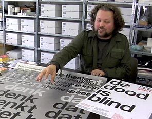
Hustwit (who also produced "Moog," about the inventor of the analog synthesizer) traces Helvetica from its birthplace at the Haas Typeface Foundry in Munchenstein, Switzerland (where it emerged from a collaboration between foundry president Eduard Hoffman and designer Max Miedinger), to its place of global supremacy. Along the way he finds almost obsessive levels of passion, disdain and insight from a fascinating variety of experts. While German typographer Erik Spiekermann wittily dismisses Helvetica as the typographical equivalent of junk food, American designer Paula Scher recalls that she was "morally opposed" to Helvetica as the typeface of corporate and military tyranny during the Vietnam era.
For every detractor, there's an enthusiastic champion like Michael C. Place (founder of the influential London design studio Build), one of several designers who embraced Helvetica after the '90s mostly handwritten "grunge type" movement (epitomized by the title credits of David Fincher's nihilistic thriller "Se7en") peaked and faded.
As graphic designer Michael Bierut observes, we may be witnessing the "end of history" in graphic design, where inexpensive software and Web sites such as MySpace will lead to the complete democratization of design trends, with the most gifted designers continuing to lead the way.
Even as that happens, Bierut suggests that Helvetica has an "inherent rightness" that can't be improved upon. The sheer tenacity of Helvetica is one of Hustwit's underlying themes: It's just too versatile to vanish from our postmodern landscape. Touching on matters of psychology, the nature of eyesight, advertising and alternative modes of expression, "Helvetica" (already available on DVD) is one of those rare films in which the exploration of a specific topic leads to expanding horizons of perception.
Jeff Shannon: j.sh@verizon.net
Movie review 